Barbara Jones-Hogu interviewed at the South Side Community Art Center by Rebecca Zorach and Skyla Hearn for Never The Same
Barbara Jones-Hogu is a painter, printmaker, filmmaker, and educator from Chicago. She studied at Howard University, the School of the Art Institute of Chicago, and the Institute of Design at IIT. She was a member of the OBAC Visual Artists Workshop and painted the actors’ section of the Wall of Respect. In 1968, together with four other artists, she co-founded AFRICOBRA, the African Commune of Bad Relevant Artists. Her work has appeared in exhibitions in Chicago and around the United States, and has been collected by many major institutions. Currently she is pursuing a Master’s degree in film from Governors State University.
Rebecca Zorach: Could you talk for a little bit about the beginnings of your interest in printmaking?
Barbara Jones-Hogu: When I went to the Art Institute I wanted to major in painting. Their major was Painting, Drawing, and Printmaking, so I had to take courses in those three areas. That’s how I really got into doing prints because I took courses in various methods of wood block, wood engraving, etching, lithography and screen-printing. I really enjoyed creating images in all of the different methods. In these courses my interested in printmaking was deepened. I enjoyed doing prints.
I met someone who went to the Institute of Design, and I knew that they had a printmaking department, but I didn’t go there for that, I went there to take painting. I could go there part-time and work. At the Art Institute, they wanted me to go full time, but I wanted to work, I didn’t want to go full time. I started working before I graduated from SAIC. Once I went to ID at IIT, the person that was teaching painting left that same semester that I came in. I did not want to leave ID so I decided to stay and concentrate on printmaking because I already had started taking printmaking at the Art Institute. And Misch Kohn was head of printmaking there and he had told me that even though his classes met during the day, he was letting me come to work on my projects at night. He gave me a key to the room so I could go and work in the studio and go to class periodically, because I was working during the day. I would take off periodically from work and go to class, you know. If he were teaching or demonstrating something significant, then I would try to be there. But if it was just a studio day and people were working on their personal projects, then I would stay at work and go there in the evenings and the weekends in order to do my prints. So, that’s how I stayed at the Institute of Design.
I became a design student majoring in design with printmaking as my major concentration. There I continued working in woodcut, etching, and lithography at first and then later screen-printing. Screen-printing became my main method of creating in the last years of my part-time studies and that is only because my woodcutting tools had been stolen and at that point I was more interested in working in color. Working in the evenings and on weekends helped me to develop in printmaking and my interest in experimenting in the different methods with the images that I felt were important at the time sparked an enthusiasm with each new print. This became important because at the beginning of my art studies, drawing was my major concern and printmaking was not my main objective for its expression but it became more dominant as I experienced creating new images in newly learned printmaking techniques.
RZ: So you got your BFA at the School of the Art Institute, then you went for your Master’s degree at ID [the Institute of Design at IIT], is that it?
BJH: Yes, at IIT. So I have a MS from IIT.
RZ: And did you start to see some possibilities with printmaking at that point that made it as interesting as painting?
BJH: Well, I was just really getting into printmaking, you know. I did not really see the possibilities of printmaking at that point. I was not thinking of printmaking as multiple prints of the same image or message. Printmaking became my main interest and concern at this point and I was not painting. I did not really start painting again until after I could no longer go to my studio because my son would become ill from the fumes, which were many in 1973. Drawing more than painting became a main interest after this time and not printmaking. Maybe printmaking would have a greater impact in my endeavors if I had followed Misch’s suggestion. When I was getting ready to graduate, Misch wanted me to go seek a position at the U of I, and I said, “oh, no, I’m not ready for that, I’m not ready for that!” You know, I’m just really getting my feet wet in this area. However, I did have my first one-woman show of prints and drawings in a gallery that was on 31st Street.
RZ: That IIT had?
BJH: No, it was a group of African-American artists that had a gallery on 31st Street, it was called 353 East, on 31st. Howard Mallory was instrumental in me having this one-person show. They were all artists, Jose Williams, who’s no longer in the city, was a part of it, and Al Tyler was a part, in terms of owning the gallery. So it was new, for me, in terms of exhibiting prints and drawings. But I was mainly interested in paintings, but I started doing more prints, and so, that carried my visual expressions. I think, in terms of being at ID and then being involved with AFRICOBRA, and of course I was a printmaker at this point. There were a lot of painters in AFRICOBRA and so printmaking kind of set me apart from them.
RZ: I wondered if you saw more of a political potential from printmaking because prints could be distributed to more people?
BJH: Personally, I was not concerned about the distributions of prints before AFRICOBRA. The political potential of distributing prints to more people was discussed as a part of AFRICOBRA, in terms of doing prints so that “everyone who wanted one could have one.” We did prints for each member’s message in the painting of their choice and distribution was a key element for the prints. All of our messages were considered political at this point. In terms of making silkscreen prints that look close to the members’ paintings, I was instrumental in doing that because of my silk screen background and because of the fact that I had moved into Wadsworth’s studio, and it was a large studio, and so we were able to put out most of the prints there. Some prints were not printed there, but most of the prints were done there. But I didn’t really think about printmaking in terms of multiple prints, per se, and just pursuing that. Personally, I only did a few prints of each one of my images. Most of my editions would be only 10 prints. Generally, I did not even make an edition of 10 images. Multiples of my images would be few in number and I would label them as Artist’s Proofs.
Later, after AFRICOBRA, Rev. Peter James Brown had asked me about opening a print shop, you know, to do t-shirts and other things like that, because at the Art Institute I had taken courses in textile printing, too. The idea of multiples and distribution would be concerns in this venture. However, at this point I was not doing political statements. My images were spiritually and religiously inspired. I also printed fabrics and did many fabric designs in yardage with students. And I really liked textile printing, and in my early classes at Malcolm X College, I taught it as a part of the craft classes. I had fabric tables with special padding for printing and various equipment in the studio that I had on 61st Street and I had a table for printing fabric at Malcolm X as well. Students would come to my studio for printing yards of a print but at Malcolm, they would print t-shirts or one yard or two yard images. Generally, the t-shirts would have political statements but they were not created in numerous multiples nor were they for distribution. I was never really business-minded or concerned with going into business and being motivated to aim for profit and accumulating money. Even though there are multiple prints for some images, I never did many prints of any of them. They were, let’s say, just prints, creations that I was making and if I got seven to ten prints from each image which would be several printings because of the colors used that would be enough out of it, I wasn’t into doing editions, I know that at ID they were talking about editions, you know, like at least 30, but some people did editions with much more than that. My main objective was never about doing many prints of one image or selling them or whatever. I was more concerned about experimentation and creating the image. I believe the influence of painting would be in this decision because generally each painting is different and not in multiples.
RZ: And did you usually do any formal editioning of the prints—numbering each print and all that?
BJH: Well, I didn’t do them on all of them, I did them on a few, it made me very aware of when David [Lusenhop] had that print done, you know, of that digital print [God’s Child],  and I had to sit down and number all of them, sign all those prints and title them, I had never really done that. Some images that I had done only have three copies of an image. Every image I would print I would put “artist’s proof” on it, you know. It wouldn’t get into an edition, per se. “Artist proof” was used on the images because there may have been changes in some of the printed images and they were not duplicate copies of the same printed image in color and design. On some of these prints, I had screens for every color, you know. So, if I wanted to, I could always go back and get a print from them. It wasn’t like I was using the same screen over and over to print different stages of an image, which is generally one method that’s basically used when you’re in school, because students don’t generally have that many frames or plates for their images or for having a different screen for every color. But, I found that I could do adjustments, changes, and additions in terms of whatever I want to do if I had a screen for every color, so that’s why I generally liked printing that way.
RZ: And the registration, was that a difficult task, or did it just become second nature?
BJH: Well, it was a problem until Advance Screen Printing and Ink Company told me about using little black tags that matched up on a cross hair. Later I started always putting a background color in my prints. So, that if there was a mis-registration there was a color that was a part of the image that would be in it. And I found that that served me well, just having a general background color a part of the color scheme. This color held everything together and I wouldn’t have to worry about registration so much. This is another reason why most of my images are “artist proofs.”
RZ: Did you do much intaglio printing, or other techniques?
BJH: I did, I didn’t start printmaking with silkscreen, I mainly worked in black and white in block printing and intaglio. The reason I started doing silkscreen was because someone stole my wood block cutting tools. I had a lot of Japanese wood cutting tools that I had collected over the years. They were expensive and I was not going out and reinvesting immediately in these tools. When I first started printmaking, I was mainly creating a lot of woodcuts because woodcuts I could do at home, and then print them at home or in the shop or studio. I enjoyed the line quality of intaglio printing, but it would take a long time to produce a finished printed image. You know with intaglio I could work on it at home, but then I had to go into ID and put it in the acid bath or place rosin on it or get whatever equipment or materials needed—I did a few of those, but woodcuts I could cut fast and cut anywhere. And, I did many woodcuts but most of the woodcuts I did were in black and white. I do have a few samples of images that I did in color, you know, now they may not be in the best condition. At the Art Institute, I had taken wood engraving and I liked that, except wood engraving is very time consuming, in terms of fine cuts. And lithography, that’s what I really wanted to do, when I finished at ID, I really wanted to do more in black and white and color lithography. You know I had muscles! Not that I planned it, but just from working on the Litho printing press and moving the stones around, I had developed muscles. And I really enjoyed working in lithography on stones. Printmakers do not do that much anymore. They have other materials that they work on to do lithography now. I really wanted to do color lithography when I left ID. I went looking for a print studio to join to do so. I had heard about a print shop on Ohio Street, I could go to for classes and work in but I could not find it. It was not listed in the Yellow Pages and no one could give me the exact name of it. However, I looked for that place and looked for it but I couldn’t find it. You know, after I finished ID, I didn’t really go back to Misch and ask him where it was, but I was interested. And I didn’t have a studio, until later and I wasn’t looking forward to buying any type of printing press, you know. By the time I got into a studio of my own, I was only printing silkscreens because I was mainly interested in color, large sizes, and an image that could be created quickly.
RZ: Do you have any of the textile prints that you did?
BJH: Not really, I may have a few. Recently, I saw a pillow and a scarf that I did using screen-printing. The one piece that I really liked I don’t know why I did this, I put it in the oven (you had to cure the print by putting it in heat), and I put it in the oven. And for some odd reason I ran to the store and came back. The store was just at the corner but by the time I got back my print was gone; my fabric had singed or whatever! I taught fabric printing to students, but I didn’t really keep samples of their things or mine. The few samples that I had were lost in my basement. So, no, I don’t think I have any textile prints of yard goods but I have some small items which I mentioned. I use to do tie-dyes and, you know, paint on fabrics and things like that. In the basement, I had some things, but a few years ago, they came and took everything out of my basement because I had mold. They said I had mold and everything had to go. I lost all of those things, because I had them all in the same cabinet, a wooden cabinet. Anything paper, wood, they even took the plastic that I had down there. Everything had to go. So I don’t have any samples of even that, but I used to do designs and paint on silk, I liked silk organza and wool for doing tie-dyes and things like that. I may have some tie-dyes or something to that order.
RZ: I wanted to talk to you about the content of your prints and thinking about how your subject matter shifted from the prints that you were making for your thesis at IIT into AFRICOBRA.
BJH: Well, I was already into doing political content when I was at IIT. You know, most of my woodcuts were political. In fact, most of my images were political but took a negative viewpoint from a racial standpoint when creating a critique of our multiple racial societies. I would say the content shifted and became more positive after I went into AFRICOBRA, because I was basically wanting to give a message in terms of action, direction, and ideas to think about to my people as the viewer, whereas the prints that I did before were always an indictment for contemplation and action against the society in which we live. [chuckles]
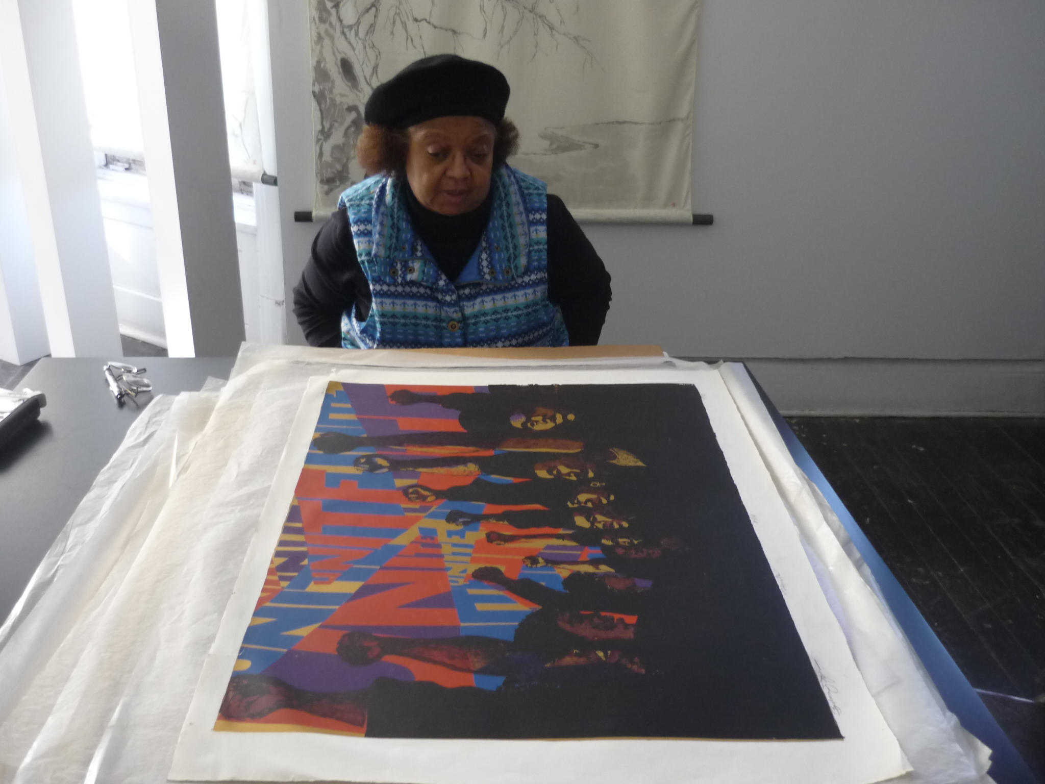
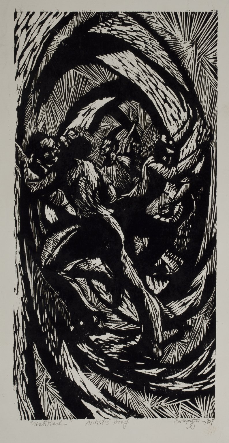
Barbara Jones-Hogu examining the first version of her print “Unite”
I think this one, Unite, is one of my last prints that I did at ID because it’s based on red, white, and blue, which were some colors I was using at the time, although I did some other things too, you know, dealing with some other colors, and African figures and heads. But I don’t have copies of those either. That would be the thing in terms of the prints, they were political, you know, but this becomes the latter part of the thesis prints and the beginning of the AFRICOBRA prints.
RZ: And when you shifted toward positive images, how did that shift happen?
BJH: In AFRICOBRA, we discussed positive ideas to portray to our people. We wanted to make positive images in making statements, in directing and motivating them with particular thoughts, attitudes, and postures that we wanted to portray to the viewers. We were working on a kind of manifesto, and coming together not only in terms of making an indictment, but also in terms of giving some kind of direction, by citing practices and experiences that we thought was happening and should be addressed along with possible positive solutions where there were problems. So, that would be in terms of what the AFRICOBRA philosophy and basically the aesthetic principles of working in the media would be the other part of that, you know, in terms of how we created the images, and how we used line, shape, color, and space.
RZ: Did you meet Jeff Donaldson at IIT?
BJH: No, I first met Jeff Donaldson as a substitute teacher in art at Marshall High School, on the West Side of Chicago, where he was teaching art. So I knew him before the Wall of Respect and AFRICOBRA.
RZ: Okay. And then at some point you worked here at the South Side Community Art Center?
BJH: I was on the board here for a short time. I don’t think I was very active on the board, but I was on the board here. And I had a few exhibits here in the early 70s. I remember Howard Seals telling me that people were complaining because I had too many exhibits here. So, [chuckles] that statement in fact broke my exhibition period here. I don’t know whether that was true or not or he was just telling me that, I told him that a few years ago, and he told me “Oh, no, no, no, I never told you that!” I said, “yes you did!” [Chuckles]
RZ: That would be an easy thing to wipe from one’s memory, you would think! [Both laugh.] If he’d said something like that. So, and you said earlier, before we started taping, you said something about a show with Napoleon Henderson?
BJH: Yeah, I remember a show that we had here, I don’t have one of the invitations, and I don’t remember exactly the show’s title, but I remember that both of us were pictured on the invitation and the flyer. I was also in some other shows; I don’t think I ever had a one-person show here (at the center). I exhibited in some other shows.
RZ: It seems like mostly they didn’t do one-person shows.
BJH: Yeah.
RZ: And did OBAC meet here?
BJH: Did OBAC meet here—no. Let’s see, OBAC met where Calypso is now [now demolished, in Harper Court in Hyde Park]. It was, at one time vacant, and we met in that room. And I think after that we met—it may have been here—different places, you know. One meeting place was only once I joined AFRICOBRA, because we met at Wadsworth’s residence and studio; it was consistent. We always met at his studio. I know, we generally didn’t go to each other’s homes.
RZ: Because he had a big studio?
BJH: Yeah, he had a large studio with high ceilings.
RZ: Do you know when that building was torn down?
BJH: No, no, it was after I left, I know I left and then a previous student of mine told me that she rented it. I don’t know when it was demolished. The city had always planned urban renewal for the area. It was going to renovate that whole area and have new buildings and landscaping. When it was supposed to happen, I didn’t know, but it did happen.
RZ: So maybe we could look at some of your prints in the Center’s collection?
I know in terms of a lithograph, I had given a lithograph for one of the fundraisers and I remember that Sammy Davis Jr. came through and bought it. I had some portraits I did at another fundraiser in the 70s. They were pastels. I use to do a lot of pastels and colored pencils in the latter 70s and early 80s. The son of Lurlean Dean has a portrait that I did of her that I really like. He displayed it at her memorial service. She has made her transition.
RZ: Okay, so you talked a little bit about Unite already.
BJH: Yes.
RZ: There are two different versions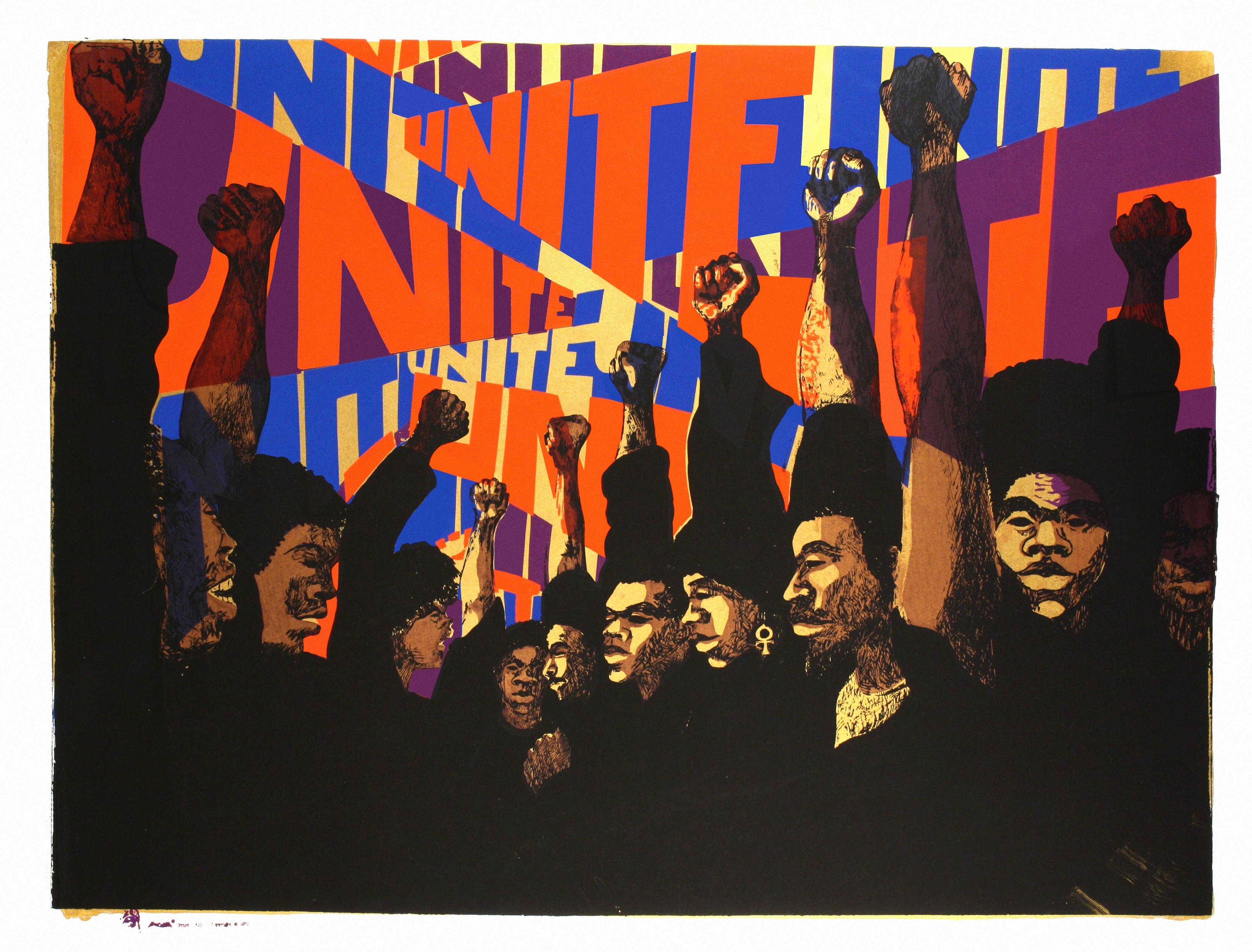 , right, there’s a Barbara Jones-Hogu version [pictured above] and an AFRICOBRA version?
BJH: Yes. The AFRICOBRA version has that African sculpture on it. It was used to differentiate the ones that I had done previously, and the ones that AFRICOBRA put out as a print. And I think we only used that African head on my print, I’m not sure, but there is one print over there at the end, right, on the left hand side?
RZ: Was it made with a stamp?

AFRICOBRA insignia on second state of “Unite” (1971)
BJH: Well, it was a part of the image in the silkscreen. So the ones you see without that meant that they were ones I printed on my own, they weren’t printed as a part of AFRICOBRA. I think I used most of the same screens except I may have changed something that was in here, I don’t know, you have to compare them, because I think I did do some changes on one of them. The title bar of “Unite” that I did states I had an edition of ten of these prints.
RZ: I think at one point you told me that this was inspired by the ’68 Olympics?
BJH: Yes, it was. I didn’t go to the Olympics in ’68 but I was in Mexico in ’68, the summer of ’68. It was also inspired by the sculptor Elizabeth Catlett, because I did go to her studio when I was there. She was working on an abstract sculpture of a woman with an upstretched arm and hand, and I thought that was a good idea. It was a Black Power stance. I thought we, as a people should unite as a people under this concept. I have a photograph of Tommie Smith and John Carlos doing this.
RZ: I think I see a difference in the gold, the gold color here is not on that one.
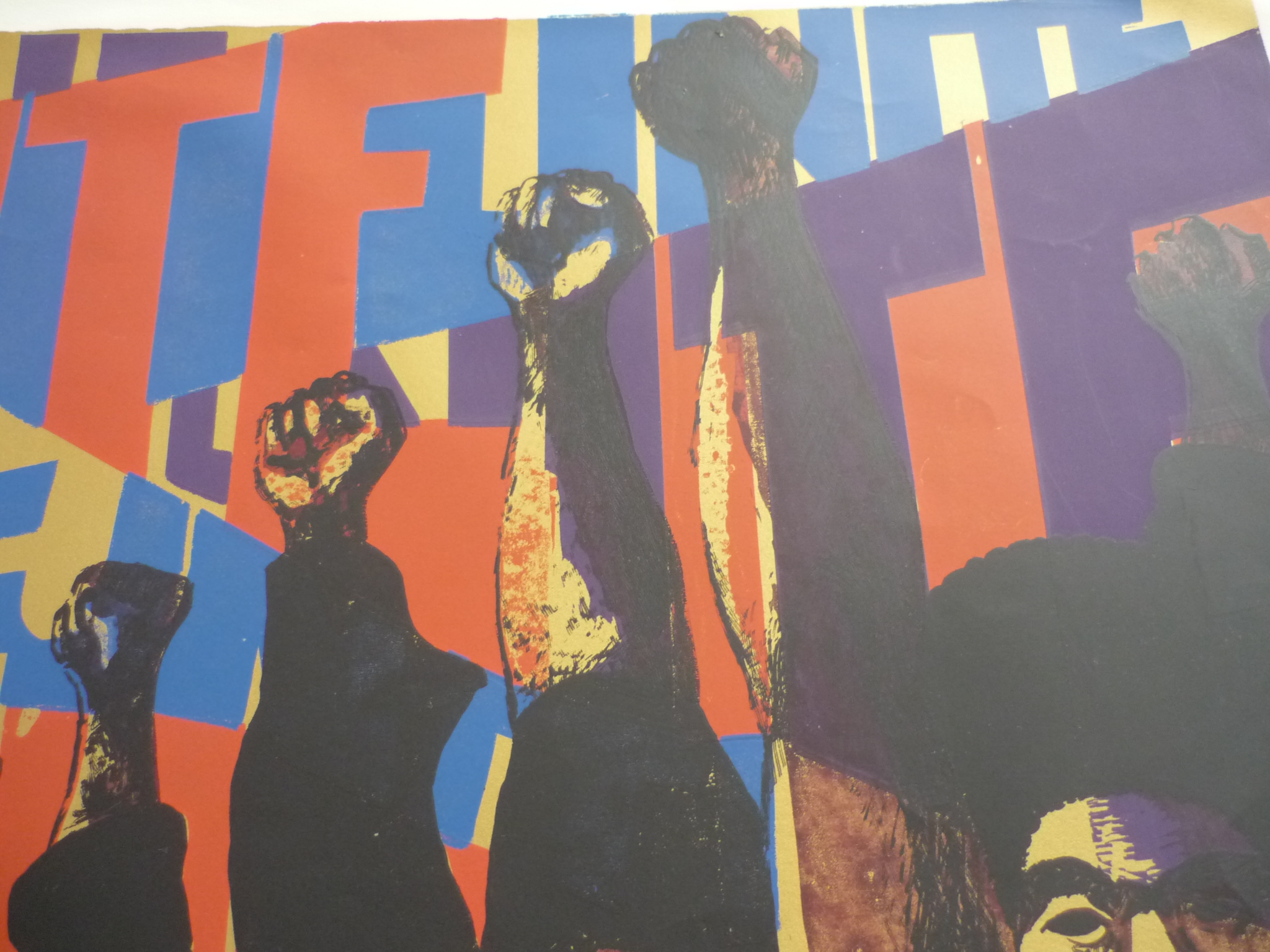
Detail of first version of “Unite”
BJH: It’s not there? Yeah, there are some changes.
RZ: I had never noticed that.
BJH: I think I used the same lettered screens and some of the same screens but there are some slight differences.
RZ: So these two [Stop Genocide] go together, right?
 BJH: They do, except this one, I have lettering on and that one I do not. But they’re the same, basically, the same print that’s underneath, the same screens were used. And well, this must have been—because this paper I didn’t print, so it had to have had some kind of mat on it or something, and, this one did not. This one is Japanese paper that I used to get from Aiko’s, they no longer exist, and I think their children weren’t interested in the paper. But their paper has a tendency to last.
Though I was supposed to be using good paper when I was printing the AFRICOBRA prints, over the years the paper became fragile and had a tendency to crack more than others. I found that the ones that I had that were on this paper (Japanese paper) did not do that. This Japanese paper is handmade paper. But anyway, the print is the same.
This was really based on the gangs. 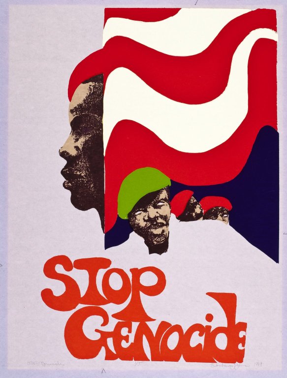 Basically I was saying that they’re using the gangs as a negative but the organization of the gangs could be used for the positive, you know, if they really came together and tried to do some positive efforts. And one of the things that they could do is stop genocide. But now they’re into a form of self-genocide. You know, that developed later, I think they had some kind of initiation for new recruits to kill. That’s why I wonder about some of this killing that’s done now, if it’s part of a gang initiation requirement, because it’s senseless, you know. Why? I know it was political before. I was there when—the Blackstone Rangers crossed the Midway. There’s photographs of the crossing which demonstrates about a thousand or more Blackstone Rangers coming across the Midway. I lived close to the Midway (on 61st Street). They were crossing the Midway for a summit with rival gangs. I think when the public saw how many boys were in that gang it was astounded. When I saw that, I could see and understand that there was great power in their numbers. But the power structure outside of the community co-opted the gangs with money. A whole lot of gang activities happened after that event. When I saw that photograph of this action, I felt that they had the potential to stop genocide, the idea of basically white on black crime, but then they demonstrated black on black crime.
RZ: So when you said, “Stop genocide,” you were thinking about stopping white on black genocide.
BJH: Yeah, white on black genocide and crime.
RZ: And that the gangs could be potentially a force to help stop it.
BJH: Yeah, but they got into black on black crime and genocide.
RZ: It seems like they had the chance to do good, but for whatever reason that’s not the direction things went.
BJH: No it didn’t happen, the gangs became a greater problem. And the gangs could be identified because of course they had their colors, you know, in terms of what color tams and clothing they wore to signify what gang and part of the that gangs they were a part of.
RZ: Do you remember what the green and the red and the…
BJH: No, I don’t. Those are the gangs’ colors that I included in the images.
RZ: Do you consider the one without the lettering a finished print?
BJH: I did, I signed it! Do you see it says “Artist’s Proof.” I did five of these. I consider this as a finished print. I signed it here, so if it were matted it would be matted up to here. And this would become his body, where you see the lettering. This says 1970, also. But this was done at IIT; this was a part of my thesis. It was printed there because I really didn’t have that studio yet, I did print in my apartment where I was living at the time. I used the dining room for my studio space and I made a print table out a large set of dresser drawers in a chest. I used the top of the chest for printing the screens and the drawers for my supplies. But I didn’t have a real set-up where I could do a lot of multiple prints. The space only allowed me to place my printed images on the floor in the living room and hallway to dry. However, I was only printing “artist’s proofs.”
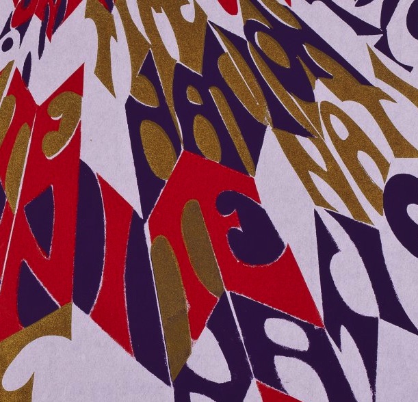
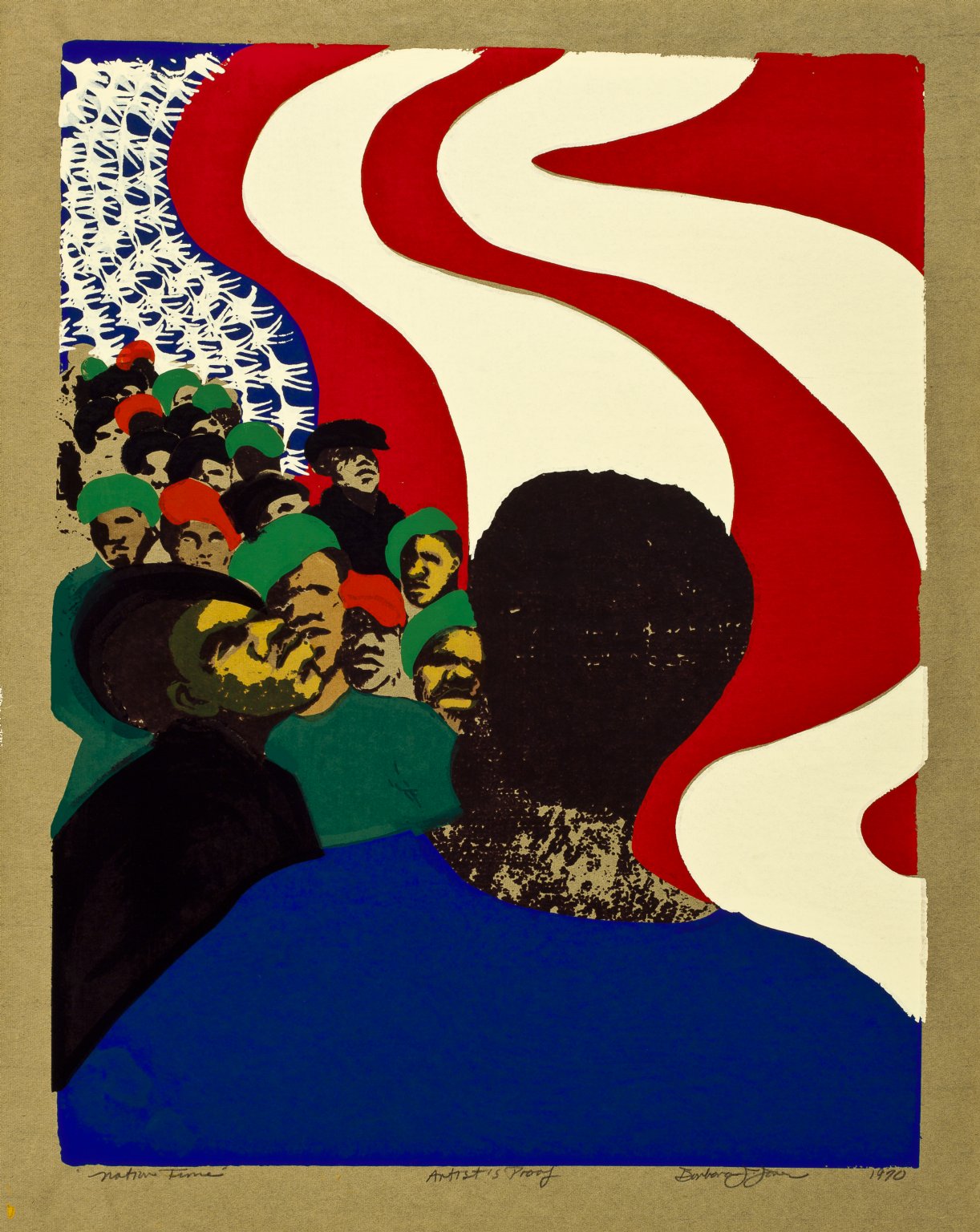
RZ: Anything about this one, Nation Time?
BJH: It says “Nation Time,” and people are coming together, as a group. The mother figure is here in the background.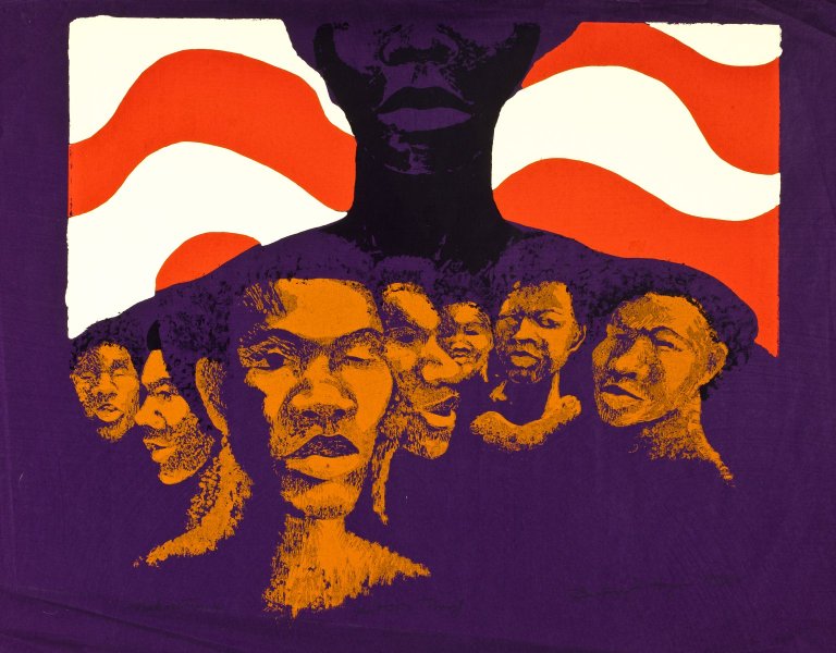
RZ: Did that name Nation Time come from Amiri Baraka?
BJH: It could be, because it was a popular statement, during that time, “nation time,” “it’s nation time,” and I think you see this in many different artists’ works. The fact that we needed to come together as a nation, as an African-American nation is important. A Black nation, in terms of black people coming together. I do still have remnants of the flag in the image. I did many prints with remnants of the flag in various images at the time, you know, in terms of the movement of the stars and stripes, and its direction. 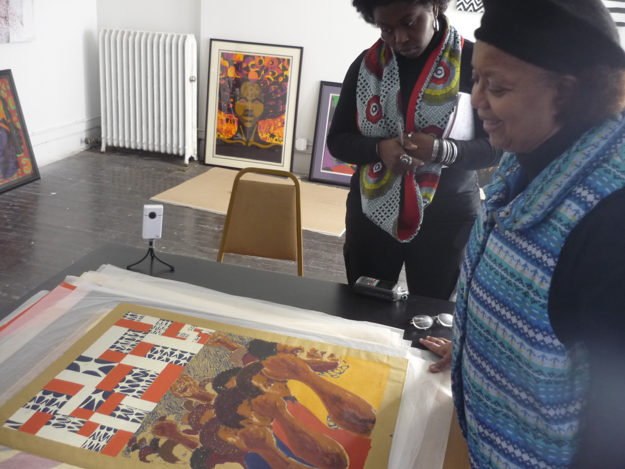 All the images with the flag were a part of my thesis project and work at IIT.
RZ: The American flag?
BJH: The American flag. In my use of the flag, the stars are the Ku Klux Klan. But this was just in terms of people; all ages and genders are coming together as a group. And I think this was just one that’s more emphatic, probably. Again, this says artist’s proof, and sees it says Nation Time, too, ’71. It had to be created right after I left the Institute of Design. But again, it dealt with the lettering. Dealing with the lettering in the screens, I use to use what was called Rubylith. 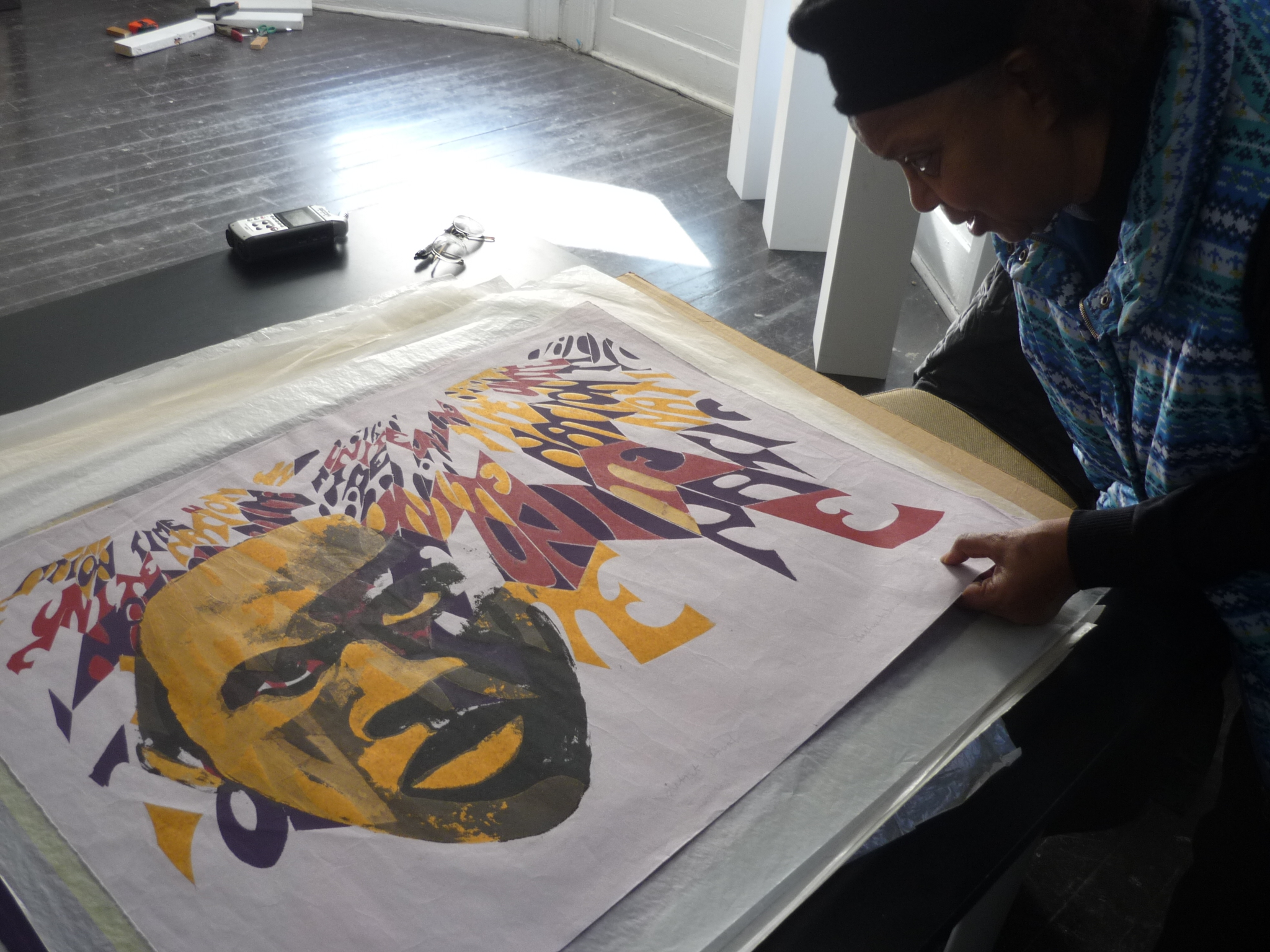 In terms of creating my screens, I always worked with a large drawing to work out the lettering and layout the design and then placing a sheet of Rubylith over it and then cutting it out with a stencil knife. For various colored areas, part of some images were created with tusche and glue, this is tusche and glue.
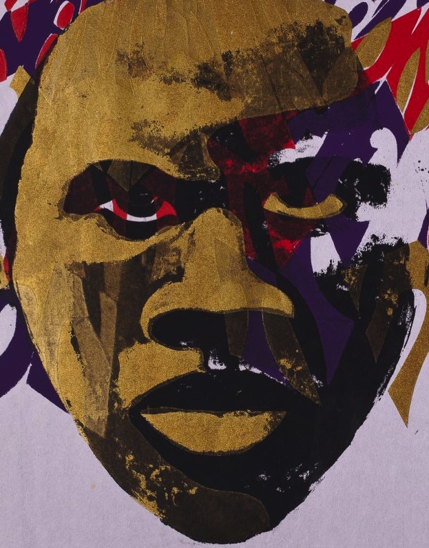
Detail showing tusche and glue portion of “Nation Time II,” 1971
RZ: Can you explain that process for me?
BJH: It’s like a glue-resist method: wherever you put the glue, it blocks the screen so that the ink does not go through. The tusche is placed in the area to be printed. The tusche is placed in the screen first and when dry a layer of glue is painted over the screen. Once the glue is dry, the tusche area is washed out with a solvent, leaving the screen opened in that area. And wherever the screen is open is where it’s going to print. Once printed, the glue can be washed out with water. Then another layer of tusche and glue can be used to print another area or to over print. The tusche or greasy substance can be liquid to paint or in sticks that one can draw with or make different types of marks, strokes and textures.
RZ: So that’s a little more like lithography?
BJH: Well, yeah, it’s closer, because tusche is used in lithography too.
RZ: It’s more painterly. It’s really nice. And so that’s for the black and the yellow here?
BJH: Yeah, that’s just for the head, but this is all screen. It’s a violet, black, and dark gold ink. I mean, this is, everything is screen, but this is basically tusche and glue. And this here is Rubylith film that you cut.
Detail showing Rubylith cut screen portion of Nation Time II
Skyla Hearn (SH): And so how long was the process?
BJH: Well, you could do a silkscreen, if you had everything worked out in a day, in terms of printing. The length of time it takes has to do with how long the drying time was for tusche and glue; the cutting time for film would depend on how long it would take for the size and area or minute details of the design. Silk screening is very fast, that’s why it’s used a lot or still in use.
RZ: Is this (Be Your Brother’s Keeper) oil-based ink? 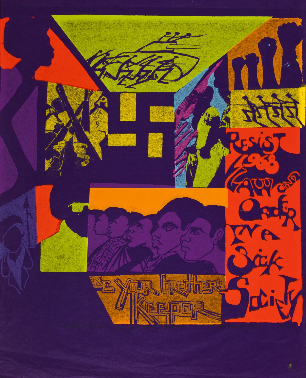
BJH: Yes, I always used oil-based inks, I never used water-based except for fabrics. That’s one of the reasons I stopped doing screen printing. When I had a studio, my son would get sick from the fumes of oil-based inks. So, it meant that I couldn’t use the inks My husband wouldn’t keep him when I went to the studio, he thought I was doing some hanky-panky because, you know, I was hanging around with all these men, he thought of AFRICOBRA and a Craft group I was in which I was the only woman. I did fabrics and leather in this group and we sold our wares mostly at street fairs. So, he wouldn’t keep him, and so I just stopped printing and even going to the studio. I didn’t like water-based ink; it doesn’t look the same; and it didn’t have the intensity that I wanted, in terms of the colors in the prints. I guess I could have tried to work it out, but I didn’t. I could have used acrylic ink, but it had a tendency to dry too fast in the mesh of the screens. I guess, I could have put a retardant in it to keep it from drying too fast, but at the time, I didn’t. I was more concerned about my child, I got into motherhood.
“Be Your Brother’s Keeper” was a part of my thesis from ID, you see that I have on here also “Resist 1968 Law and Order in a Sick Society.” This grew out of the convention, the Democratic Convention that was here in Chicago. What happened was that I had been in this movie. I think they had thought that there was going to be many confrontations by Blacks during the convention. I think during the spring of that year Haskell Wexler, a filmmaker and his crew, were on the West Side interviewing and filming people that they thought were radical and would give some insightful forecast of the summer unsocial and political turmoil. Jeff Donaldson and Robert Paige were a part of it and…
RZ: Was it Medium Cool?
BJH: Yes, Medium Cool.
RZ: You were in that?
BJH: Yeah. They did not use what I said, and I really wanted to see my section, because we kind of improvised what we were stating about the racial and the political attitudes and conditions in the city. We were in this apartment and we were asked questions or asked to state our concerns about racial and political tension among various interactions in our communities and in the city with a projection toward what may happen in the city during the summer and during the convention. We improvised what we stated, but it was, it was almost like when I did my section I went into a trance or whatever and then when it was over I came back out, and when I was in New York and I was coming back on a plane and saw an article, someone had made some comments in Newsweek about what I had said and I said, “I’ll read this article when I get home,” but when I got home I didn’t have that Newsweek. I don’t know what happened to it. The filming of the movie was based on controversial and radical thoughts about the convention. The filmmakers wanted to document persons expressing these thoughts, which could or would possibly cause a riot or some kind of upheaval to happen during the convention. However, many of the black radicals thought there would surely be blood shed in the streets if turmoil did occur and decided not to cause any problems. They decided to leave town or keep a low profile. So, nothing happened concerning the blacks’ rioting or participation in the mayhem that surrounded the convention. There were many people against the convention. I went down to see what was happening to the protestors, because the comedian Dick Gregory was leading them. Right. And, the police and military had them stopped on 18th and Wabash. I was up on a fire escape of a building, trying to look over into what was happening on the street between the protestors and the military. The military were on the street corralling them with tanks and blocking them from going downtown to the convention center.
I was down there when they had them blocked. The streets were almost pitch black with lights projected toward the protesters. To see all of these interactions between the police, military persons and protesters and to hear the loud speakers broadcast the threats and the conditions under which the protesters could not advance and told to turn around and move toward their previous locations with large flood lights projected toward the protestors… all of the lights and the actions were just astounding and insightful of what law enforcement could spring on society. And I said to myself “I did not know that this type of law and order could be so insidious in the north.” I had never seen anything like this before in the news for the north. The guns and the lights on them and various actions against and between the military and the protesters caused me to think that we should be our brothers’ keeper. And in fact, I have on the print, “be your brother’s keeper.” You know, most of the people that were going downtown were white, they weren’t black. So, the media and the city administrative powers thought that it was going to be a racial upheaval, but it didn’t turn out to be. The upheaval occurred from the perpetrators of “law and order in ’68,” and not from the protesters. So, law and order should be resisted in a sick society where the laws of the land are not followed and upheld. “Resist Law and Order in a Sick Society.” The peaceful protesters had problems assembling, marching and expressing their right to free speech and their views, which are provided for in the first amendment of the constitution.
RZ: Is that Dick Gregory? 
BJH: Ah, no, it could represent him, but that’s just a person that’s a part of the protesters. [Chuckles] There are some symbolic figures in some of my images but I wasn’t into doing portrait-like figures or realistic portrayals. The group of brothers at the bottom was to probably represent the Panthers, a group of brothers, and because you know they have African dress on… some do, some don’t. And the fact of being your brother’s keeper is one of their concerns. You know, being responsible. The other parts over here are images in terms of Black Power and that we still have to come together. And image is broken up into shapes that depict the various activities that occurred on 18th and Wabash with the MPs, the National Guard, the police, the protesters, and my concerns for these types of actions and everyone that was out there that night.
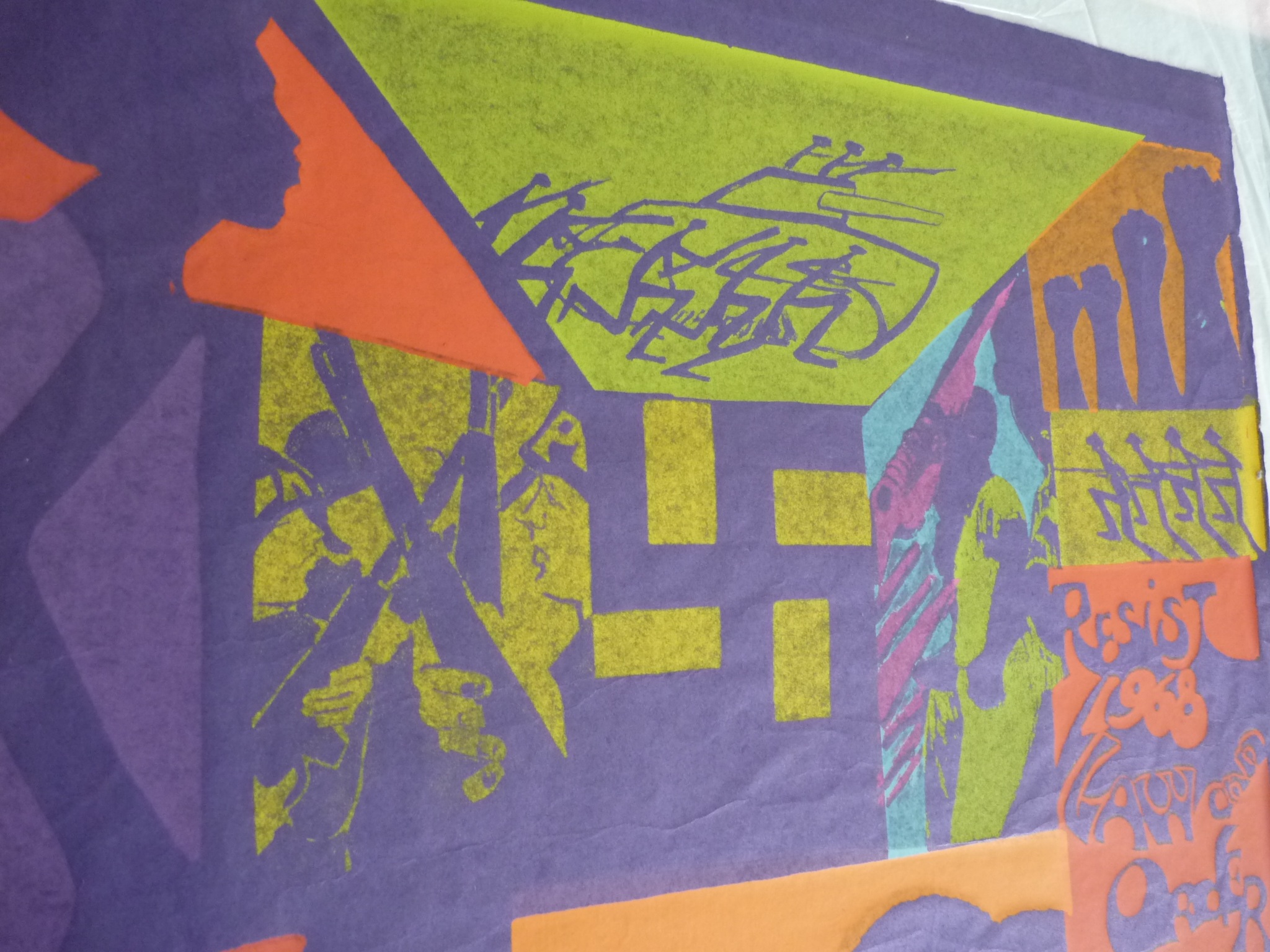 Such as the fact that they had tanks out there, I mean, real tanks for Americans confronting Americans, you would have thought that we were at war, and so this print is basically used to represent racism because they really thought that the police and military would be confronting blacks and not whites. There were other blacks in this group beside Dick Gregory.
RZ: Yeah, that’s pretty powerful. This is that Japanese paper still?
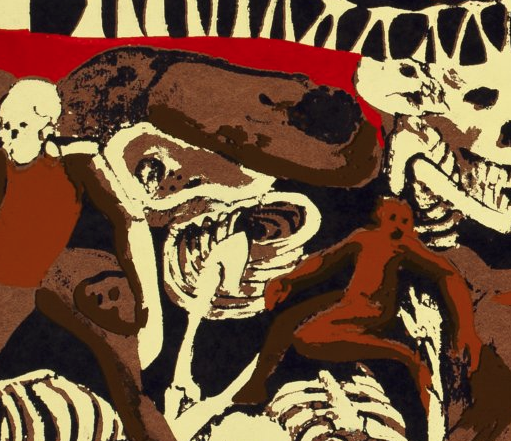
BJH: Yeah, it is. The paper has stood the test of time and has not faded or broken down. The image is a part of uniting under the band of protest. T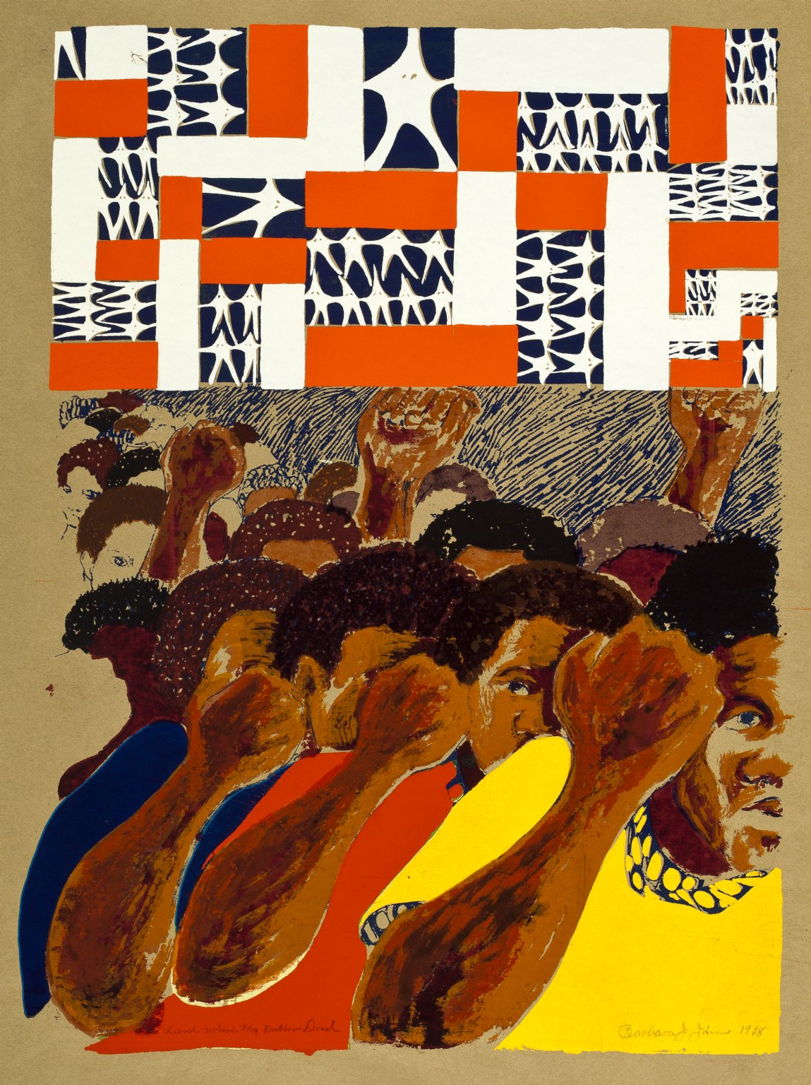 he swastika is used to represent racism, governmental control, oppression, suppression, and fascism it is used in several of my images, but in this one it is used to illustrate the red and white stripes of the flag while the stars symbolize the Ku Klux Klan. This image was created in ’68. I have the title as “Land Where My Father Died.” I did some other prints with this same title with different content and a painting with the same idea and arrangement as a litho print that was done in black and white of when my father died. I feel that racism and fascism played a great deal in my father being successful or not successful in his life, so some of these prints’ ideas and content deal with the fact that we and he were not really free to do whatever we and he really wanted to do and could do due to radical oppression and suppression.
RZ: So that was quite personal—“The Land Where My Father Died.” Not just father in the abstract, but really thinking about your own father.
BJH: Yes. The land where my father died.
RZ: Is this done with tusche and glue?
The tusche and glue was used to get some value changes into the skin of the figures. I dropped that out. This procedure would be the earliest part of working with the content of the image on the silkscreen. You have to use many screens to get great value gradations of colors. I only used a few screens.
RZ: So is that, did you drop it out because of the laborious process?
BJH: Yeah, the number of screens that you need to get gradations, you know, I wasn’t really into photographic silkscreens. Many students majoring in photography used their photographs and did silkscreens based on their photographic imagery, because ID did have a plate maker. An instrument that would put a photographic image on a screen. But I didn’t really use it much, ’cause I didn’t really like what the students were doing, so, I really didn’t go that way, in terms of using the plate maker. Most of my things are drawn, painted, cut film or tusche and glue. The fact that it may look blocked and may not be blocked. It looks like one thing when you’re drawing with the tusche and, the stick, and when you put the glue on it you may be getting what you thought you got, and sometimes the greasy substance doesn’t clear out, so you’ve got the glue there instead of the gradation you may have wanted. It was like working back and forth in terms of doing that, so most of these screens were done at the ID.
RZ: So with that factor of chance of it not coming off the way you expected, did you ever get effects that you liked, or was it just annoying?
BJH: Well, it was not annoying, it got to a point where, it’s “describing” the area you want and in terms of working towards what it should look like. You know, I would say, let me see what if I put it on the next print of the image and see what happens. Whatever I learned out of this print, I would put it in the next one. If it worked in the next one I would decide to use the technique in the final print. You know, the Rubylith is cut with a stencil knife or some other cutting tool and it may be held like the tools for cutting a woodblock; depending upon what types of cuts are made.
Looking at “America II,” 1969
RZ: It looks like a woodcut, yeah. But how did you make that, actually?
BJH: It’s just using a grease stick or tusche stick and drawing with it, similar to that, and then this is where the glue is blocking the screen. Whatever you see as the color of the paper is where the glue was.
RZ: Okay.
 BJH: And wherever you see the ink is where it was open. And whatever color you see was open, so you can see that there’re a number of different screens I have used to make this.
RZ: That’s a lot of work.
BJH: Yeah, because, you know, you can only print one color at a time.
RZ: And you presumably also had to be careful about what you printed first, because of the way the colors would interact with each other?
BJH: Yes. But some of these colors are somewhat transparent; there is a medium that you can put in the opaque ink to make it transparent. So, transparency depends upon how much medium or extender you mix with the color in order to see one color through another color. Various colors and transition changes in color are possible based on the opacity or transparency of the colors over lapping each other. Whether you’re going to use the ink’s color as an opaque color or have it block out the color beneath it or have the option to use it with an extender in it to make it more translucent or transparent in color create many color variations with an oil-based ink or a water based ink and variations of colors depend on the order in which they are printed.
RZ: This is a heavier paper.

America III: While Some Are Trying To Get Whiter
BJH: Yeah, but it’s still the Japanese paper. So this is another one, this just says America III, done in ’69, and it says I have nine of these. I think this paper was brittle, although this is a Japanese paper. This is a Japanese paper also. But it still had to deal with racism, and it’s an earlier piece, even though it has ’69 on here, when I was at ID, it was printed there. You know, tusche and glue was used to create this image. I drew with a grease stick or drawing tool or painted with tusche and then put glue over the drawing to block out the screen. I did many prints with skulls and skeleton to represent the idea of death. Pain and agony as well as death are a part of the content of this image in which the title states various experiences and projections of our endeavors.
RZ: And that was kind of along the same lines as the KKK and swastika images? America’s death?
BJH: Yes. As representing death, so this is basically the same thing. I have on here “while some are trying to get whiter,” you know, in terms of the fact that you have that separation in terms of whatever people are looking forward to within their lives, there’s still this idea about the devastation that’s happening within our society, and we being a part of America. But you have that division, you know, some black people do not want to be black. When I was young with a new Afro and African apparel my mother rejected the positive concepts of Blackness. My mother was dark, looked dark, but she would never claim that her ancestors came from Africa. [Chuckles] She was Creole, she was from Louisiana, so she was a little of this, French, and a little of that, Spanish, and a little of the other, American Indian you know, she was a little Negro but not African, so you had people like that that didn’t want any association with Africa.
RZ: So, were you thinking about the skull as kind of the whitest of the white?
BJH: No, it’s like death, the skull has always represented death to me. So, the skull is like death to your culture, death to you. You know. Being the real you or whoever you are, it still represents death. And the fact that in terms of assimilation, I mean, assimilation is good to some degrees, but if assimilation says that you aren’t anything or worth anything, then assimilation is bad, because you’re rejecting yourself. You shouldn’t reject yourself. You know, I can be with you without rejecting who I am. So. I have to come to that decision.
RZ: Do you know how these prints came to the Center? Did you give them?
BJH: I gave them. I’m sorry I did not find all of them—I had prints that I could not find that were in the basement. I gave them to the Center and there were prints that I’d lost. Anyway, these were prints that before I had the flooding in the basement that I had gotten together and I was going to give them away, so. I gave them to the South Side Community Arts Center, I have had exhibits here, and so, I gave them here. I thought about the DuSable Museum, but that’s another story.
RZ: Well, it’s lucky that they were here and not in your basement!
Untitled woodcut, 1967
BJH: Yeah, that’s true, that’s true. I’m sure the Creator had another reason. This is one of the woodcuts; it’s a small print, created on pine wood. You and get this wood nice and cheap. In was created in 1967, and of course again it says “Artist’s Proof,” as I said, I signed all of them artist’s proof. And it is untitled, but it also also deals with the riots. And pushing against the forces that bind, limits, and constrains us as well as fighting against whatever’s in us that we have to fight against within ourselves and within our society. So, these figures are right there, caged and they’re trying to force their way out. They are concerned with getting out of their ordeal. This is another print based on the gangs and Black men. This was probably done the same time as that other one.
RZ: And that one is called Nation Time. I see—they have the berets.
SH: And, were these the colors they used or were these just colors that you used?
 BJH: The colors I selected. But they may have had red and green tams at the time. Because they were always colors, specifically, but this is to represent the flag, that would be representing the red-white-and-blue up here. And the fact that he has on blue just carries into my color scheme for the screen. But this would have also been tusche and glue, this is not, the ones that you see that are hard edged were done with Rubylith. This is where the gangs come together with a positive male leader (the foreground figure) to lead them against their oppression in America.
Oh, “High Priestess.” But I used the same kind of color scheme, the red white and blue, the color of the paper. And this is a design, but it’s still the waves of the flag, I don’t have the stars in, but this is the High Priestess. You know, the female being the queen.

“High Priestess”
RZ: It seems like you’re starting to get into the Coolade colors.
BJH: Well, this is before, this is really before the Coolade colors. When I started doing silkscreen is when I really started using colors. I don’t know if I gave them anything with woodcuts, I maybe have a few woodcuts, two or three woodcuts with colors in them, but with silkscreen you can use a lot of color, it’s a part of the medium.
I think I have another one where I used the High Priestess in it. This is an early silkscreen that I did. I did some with masks and other things. This is just one color. All of these say 1969 on them but I didn’t do them all in 1969. But they were probably all prints, because I do have a print like this with color. I don’t know whether they have this color, this is just the black screen, and then I have rings of colors around these masks, in another print. But I don’t know whether there’s a print like that here or not. But this is the black screen, before I worked on the others, because sometimes I would do more black prints with colors in them.
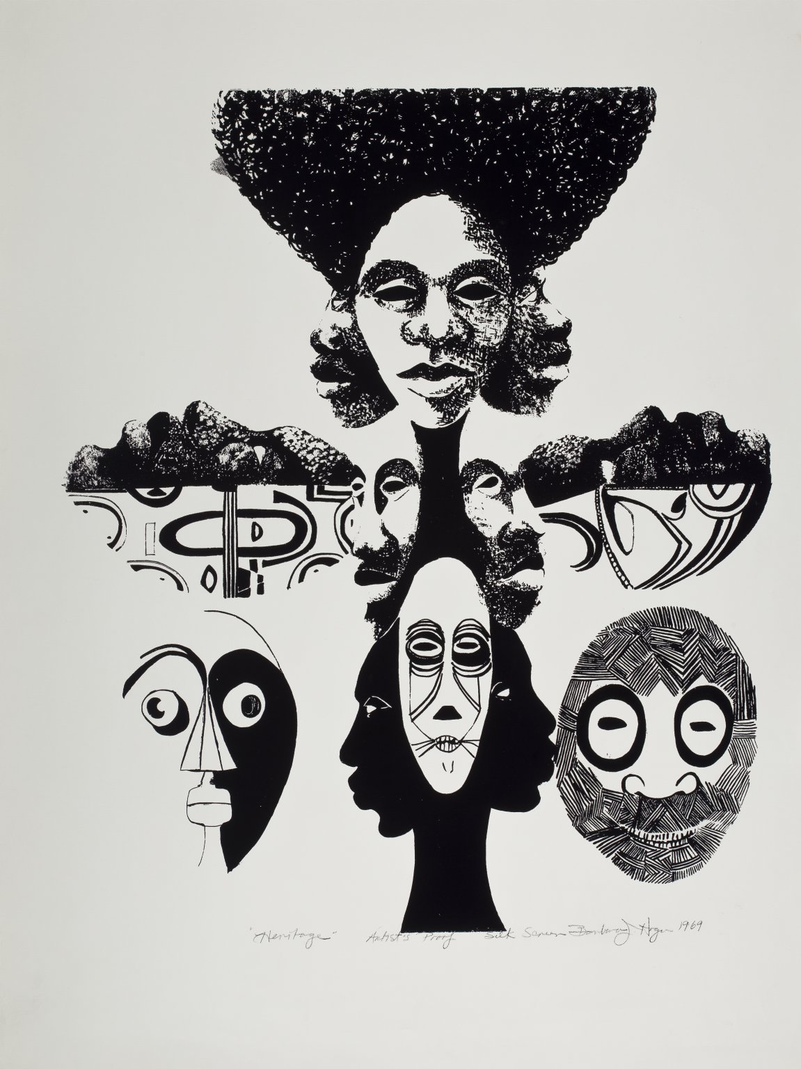
“Heritage”
RZ: And is it, I’m thinking about the High Priestess image we just looked at, and this one, “Heritage,” do you think of those as related?
BJH: Well, yes, there are similar heads. You know, that the prints were created during the same period of time or around that time. Again, this print is tusche and glue, that’s the other side of it. There are shapes and textures in this print that you can’t get with Rubylith.
RZ: So that’s not Japanese paper?
BJH: No, it’s not. I remember that I had ordered that paper for the prints and some of the prints that we did for AFRICOBRA. The paper didn’t stand up over a period of time. I did many prints on this board. I don’t have any more. I used to get it at an art store downtown, and this fellow used to sell it to me at a bargain price because I brought numerous boards at the same time. I used various gold and copper colored boards. I used these metallic colors and precious metal inks to symbolize that we were precious and we are, precious, so I used gold. Again, the content was created with tusche and glue. The title area states that this was created in 1970. 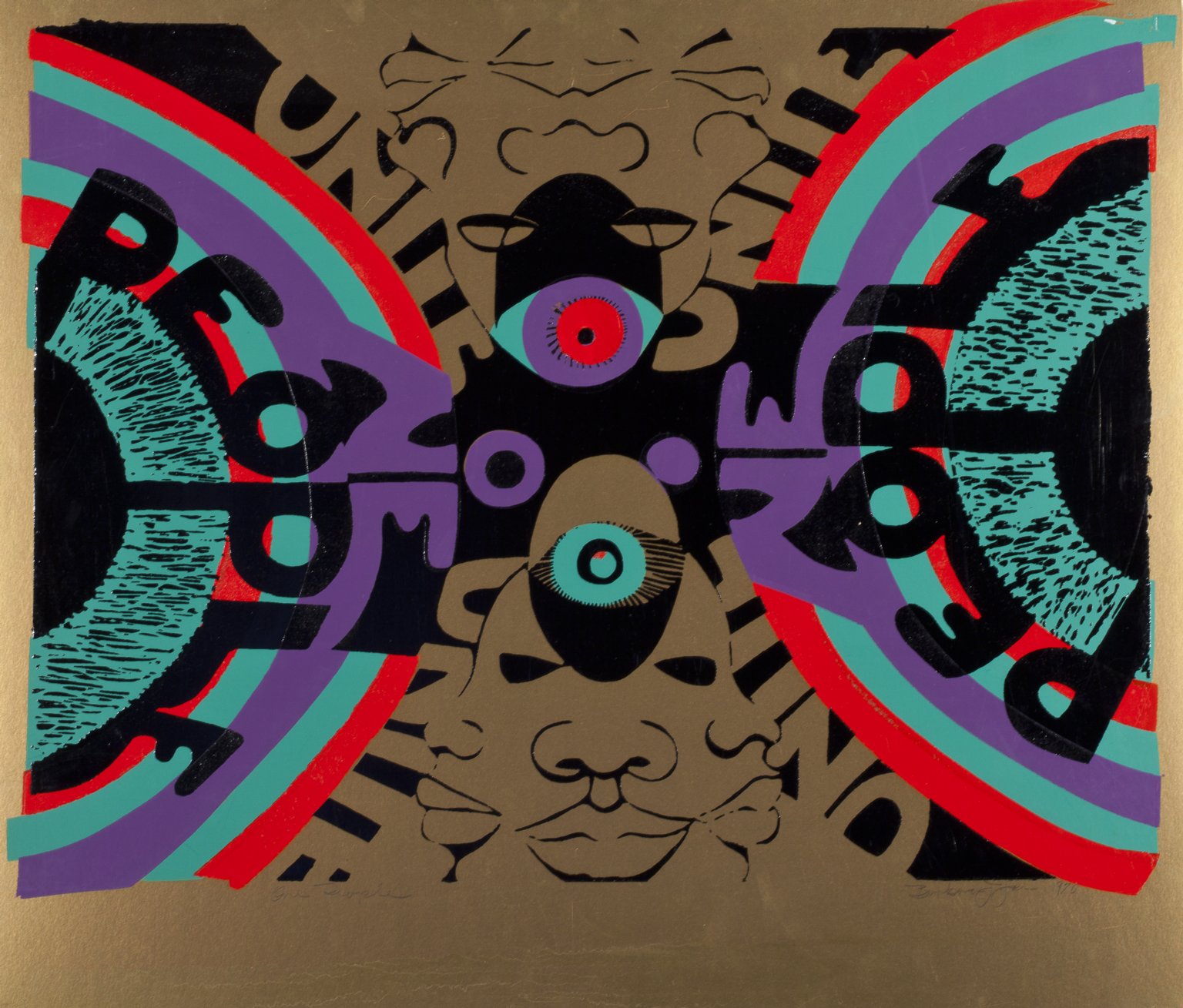 But I know I’ve done other things, I had a series of different prints that I did on this board. The place where I got the boards went out of business. So I stop printing on boards and started to use gold inks. But you know, I got gold ink from Advance Screen Printing Company, the gold that you see in this print. They went out of business also. Anyway, this says “One People,” so there’s another thing that’s happening with the eye, you could say, going into an all-seeing eye.
SH: Aside from what was happening in the society and your experiences, were any of your pieces influenced by what you were reading also? Any particular authors or books?
BJH: No. I read many books at the time, but I couldn’t say whether I was trying to illustrate a point from the books. Possibly!
RZ: That’s relevant to this print, 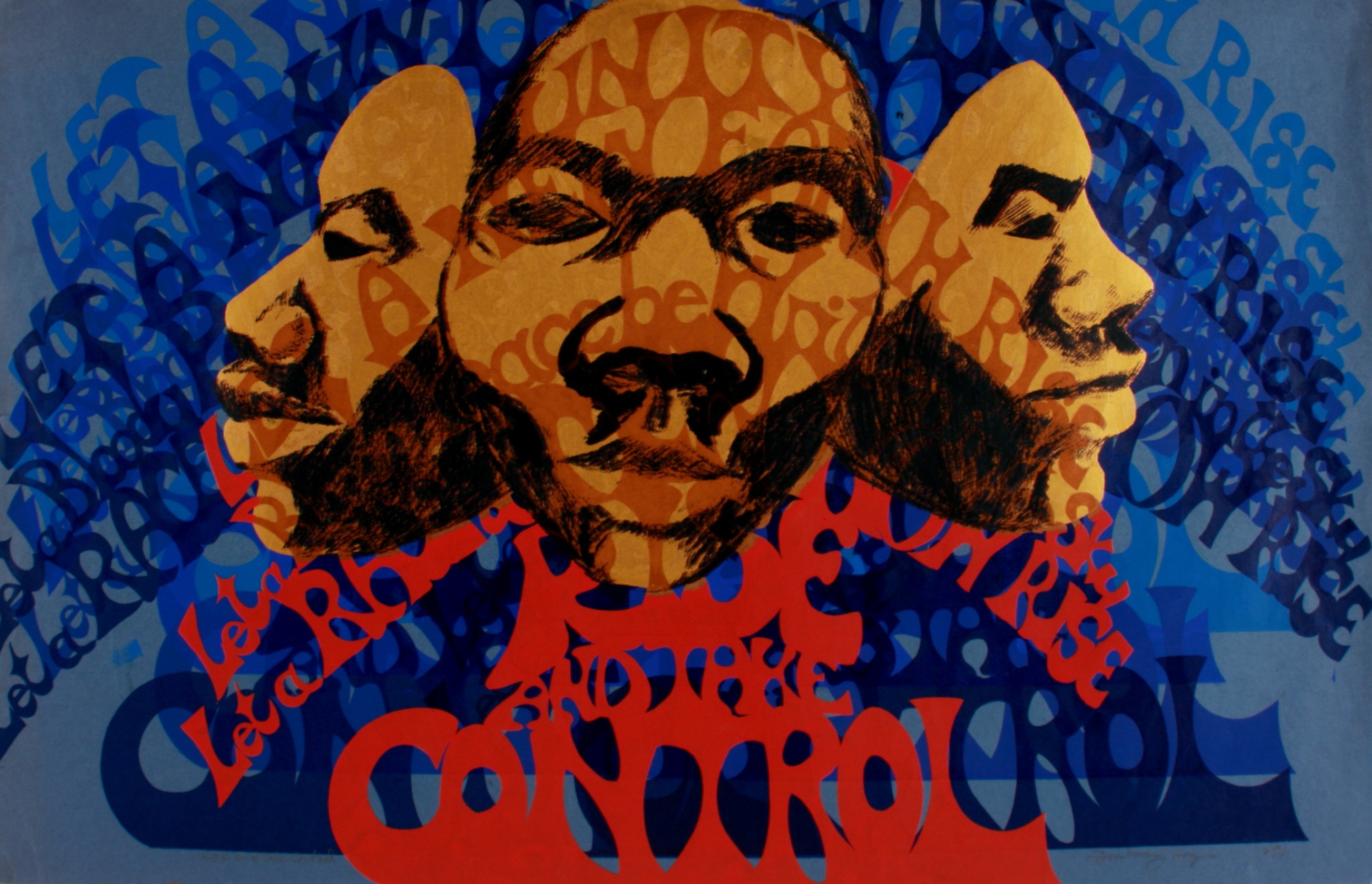 because I had the idea that the title for this print had come from a Margaret Walker poem.
BJH: Rise and Take Control? It may have. Yeah, yeah, it probably comes from a poem. Let me see what it says…
RZ: Yeah. And that’s an AFRICOBRA print?
BJH: Well, you could call it an AFRICOBRA print. It says on here 1971, so I would say this is an AFRICOBRA print, during that time. But it still has red, blue, gold, and the color of the paper, they’re not really what you’d call Coolade colors, per se.
RZ: I have to keep reminding myself that it’s a little bit different with you because you are a printmaker. I mean, everyone else who was in AFRICOBRA if they made a print it was an AFRICOBRA print. But if you made a print, it could be an AFRICOBRA print or it might be a Barbara Jones print.
BJH: I created some images with three heads, a series of different drawings with three heads that signify looking at the past, looking at the past, and looking to the future, that’s what the three heads represent.
RZ: Yeah, so that kind of ties into the one that states, “know the past, prepare for the future.”
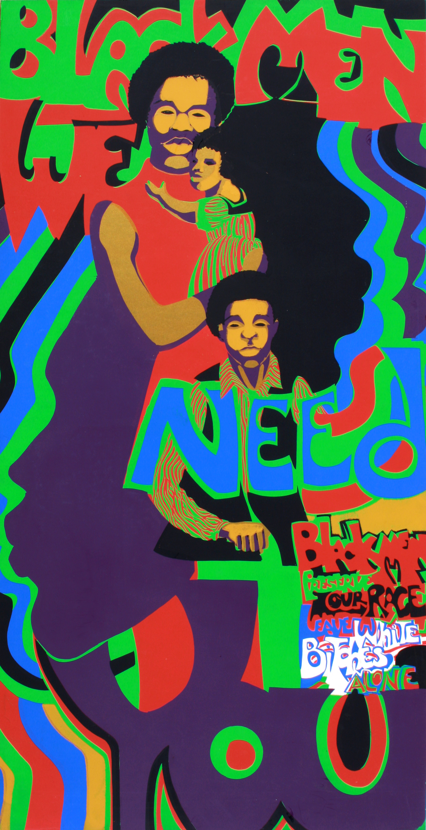
“Black Men We Need You”
BJH: This one is Black Men We Need You [chuckles], some people got upset about the fact that I put underneath “Leave Those White Bitches Alone” down there. However, during the Civil Rights Movement, we had many males that were talking black and sleeping white, you know, that is what we called it. That’s not what they had in their art, but it all comes down to what I said.
RZ: I’m not offended, don’t worry! [Both laugh]
BJH: And this one is just, Relate to Your Heritage. Really, Black women, relate to your heritage. So, on this it’s basically speaking about, I took orange leather and wrapped my hair like the figure in the image. That was done for a SSCAC a costume party held here. It was just a style at the time without a reference, but later in Africa, I saw hair wrapped with black heavy threads in many different styles. But in terms of thinking about my natural hair, and the hair and clothing attributes from Africa in terms of the African dress and adornment, I painted designs on the faces of my figures because some African women paint designs on their faces and used African symbolisms. I used to wear head wraps.  Najwa still wears wraps, and she’s probably one of the few that still wraps her head, but during the ’70s everyone in my circle related to imitating or creating African fashionable attire.
RZ: I think it’s coming back.
BJH: Yeah, it is. It is a resurgence of it. And this one, To Be Free. I think it started out as TCB, Take Care of Business. That’s what’s up at the top, TCB, take care of business. And “To Be Free” is more direct, you know, that we have to protect ourselves, come together and protect our community. And I think that’s still relevant.

To Be Free (TCB)
And a young man I was taking a printmaking and digital class with at Governors State initiated an act of bringing in some previous print works that we had done to discuss them, and I brought in some prints, and my prints were so much larger than what the other students were working on there. Their silkscreen prints were small. The ones that I brought in were extremely large. I never thought about making little bitty silkscreens. You know, always thought about making them large. And I like them large, so that’s the other side of the story. The paper of this print became very brittle and when I was moving it the paper cracked and tore. And this one is To Be Free (Know your past and prepare for the future). You know, and so you have someone talking about the African past. They’re talking about Africa and their culture, but the men in the background have their guns. And it’s so painful to see all the rebels in Africa and what’s going on there in terms of annihilation of their race.
RZ: And the sun in the upper right corner?
BJH: Yes, I used a mask to depict it. It’s the sun, but it’s an African mask, it’s like a spiritual theme, an African spiritual leader.
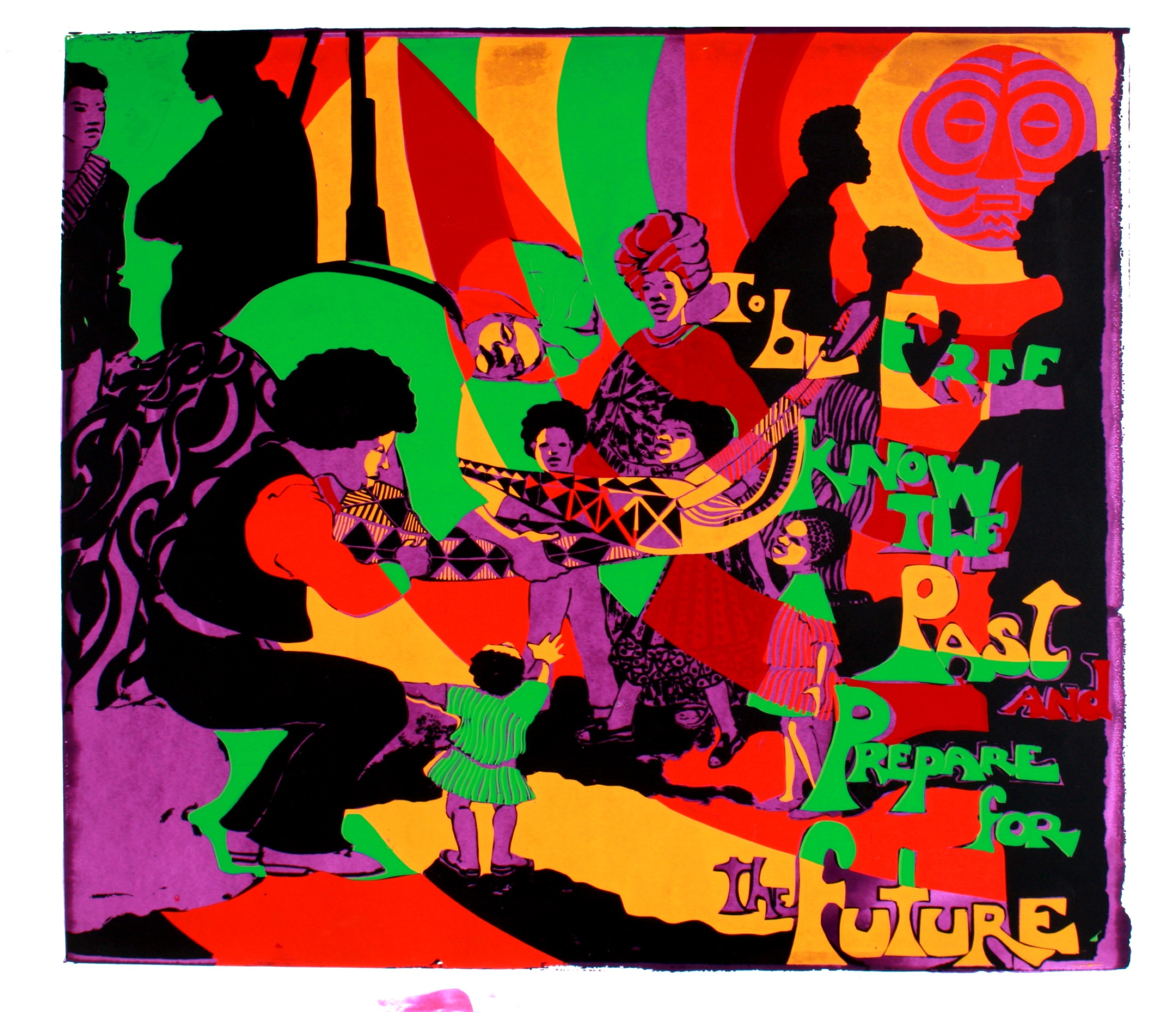
To Be Free (Know the Past, Prepare for the Future)
And I believe when the Egyptians were speaking in Egypt of the God of Light as she Sun God because that was the brightest Light.
They speak of the sun god, I’m thinking of them speaking about the greatest light, and so they’re calling that God. You know, the sun god is still the light, so that represents God to me. It does not specifically represents an image deity, but it does represents the light that illuminates our universe.
